New Twitter
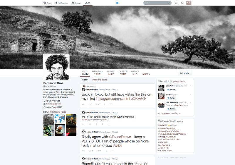
Twitter has a new and impressive layout design. Overall, the look is big, stylish and media-focussed. I’ve updated my profile this morning and here are my impressions. Styling Your Profile Changing the look of your Twitter profile just got a lot easier. Everything happens on the main page, by using an edit profile button. It’s […]

Twitter has a new and impressive layout design. Overall, the look is big, stylish and media-focussed. I’ve updated my profile this morning and here are my impressions.
Styling Your Profile
Changing the look of your Twitter profile just got a lot easier. Everything happens on the main page, by using an edit profile button. It’s similar to G+ and LinkedIn, but even easier. You’ll want to change your header background to a bigger image, 1500×1500 pixels and your profile image ought to be 400 by 400.
Also, you can change your biographical and location information right in the main window, rather than having to go into your setting menu. And, your profile colour is now picked off a single colour matrix, which you’ll find just below your bio and location information.
Media Matters More

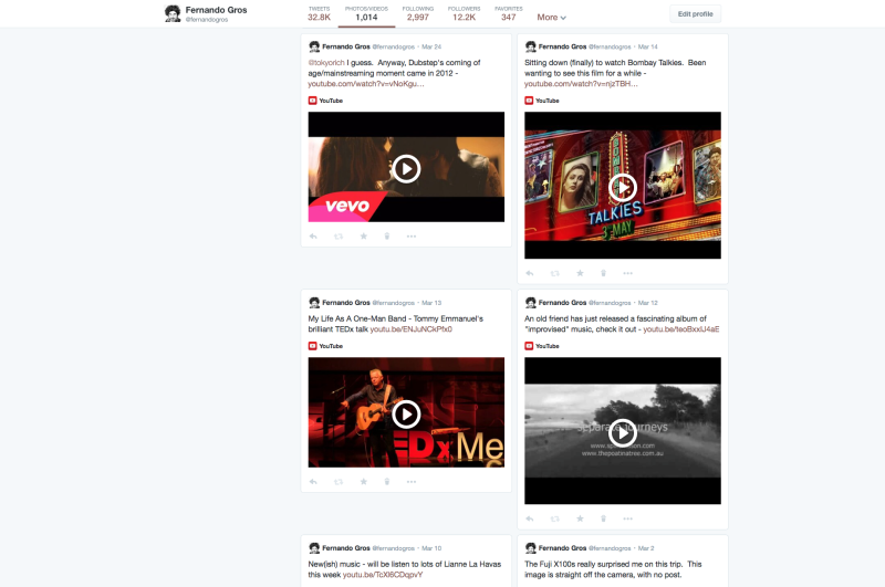
Click the Photos/Videos tab next to the profile and Twitter delivers a new media page, which makes embedded photos and video a lot easier to see and navigate. It’s a big shot across the bow of G+ and has already got me wondering whether this is the final reason to (really) quit Instagram (especially when added to recent changes which allow you to tag people in photos and add up to four images to one tweet). Right now my media page is mostly curated links, but I’m suddenly wanting to fill it with my own images!
Pins And Text
A new feature allows you to pin a tweet so it stays at or near the top of your stream. This will be controversial for some users but I like it. Pinning recognises that for most of us, all tweets are not created equal. You can access the feature by clicking the ellipsis (…) on a tweet, to reveal a “more” menu. You don’t have to pin any tweets and once a tweet is pinned you can unpin it.
I’m thinking the best way to use this might be to pin the most important tweet of the day, the one you want everyone to see, for a while, not permanently. Or, you could use this to pin a link to a current project, or recent launch, whatever you want people who visit your profile to see first.
And, I have give Twitter some credit for vastly improving the typesetting and readability of the layout. While some of the sidebar menus are still a mess, the main text, in the tweets, is clear, big and easy to read. While overall, the use of whitespace and removal of distractions, is improved.
Finally, it’s worth noting the way the new layout separates tweets (unique tweets sent to everyone) from “tweets and replies” (the old format with @-replies mixed in amongst the global tweets). This might confuse some existing users, but I suspect it will help newcomers and also help when checking out someone’s profile before deciding to follow them.
The Only Complaint
Twitter can’t quite figure out what to do with lists. Right now, you find them on the main profile bar, by clicking a pulldown menu called “more” which reveals only one item, “lists.” Why Twitter didn’t just simply make lists the pulldown menu is beyond me. Lists are a powerful feature, something that Twitter does better than any other social media platform and yet, the feature is not prominent and remains unknown to many users. I wish Twitter would bring lists out of the shadows!
Still, this is an impressive update. I’d encourage Twitter users to check it out and, for me at least, the new media features have got me excited about changing the way I share images.


