The Rule Of Halves
A lot of photographic conversations get stuck at the rule of thirds, perhaps forgetting that although it’s a powerful grid system, it’s not the only option out there.
Craft & Vision just released an e-book entitled Beyond Thirds. This week I received a copy of David duChemin’s latest book, Photographically Speaking: A Deeper Look at Creating Stronger Images (Voices That Matter), which also contains some discussion of the the rule of thirds (a full review will come in due course). Moreover, I’ve had a lot of conversations lately with photographers where the rule of thirds keeps coming up.
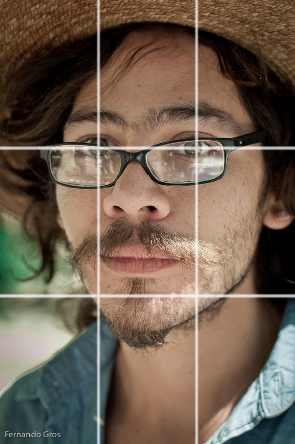
I often use the rule of thirds, especially when struggling to compose a photo, or balance elements in the frame. But, using the rule of thirds doesn’t always feel right. And, to be frank, some of the reasons that photographers give for its power don’t gel with my visual sensibility.
Perhaps the problem is that many photographers learn about composition from other photographers, or books and courses about photography written by, you guessed it, photographers. It’s a closed loop and in any field of activity, closed loops create distortions.
The rule of thirds works, at the most basic level, because it’s a grid. Visual design, from architecture to typography, from painting to magazine layout works by using grids, of various forms, to bring order into a visual composition. Grids allow us to balance elements, create order, identify patterns, manage symmetry, develop consistency and generally understand how the shapes in our composition are working together.
The rule of thirds is one type of grid system. But, there are many. Some combine different numbers of rows and coloumns. Some, even have asymetrical patterns. Garr Reynolds, in Presentation Zen Design: Simple Design Principles and Techniques to Enhance Your Presentations, points out that even the humble Bento Box is a form of design grid – it allows a small number of colourful, differently shaped and textured food items to sit close together in relative harmony. That makes me wonder what photos shot with the Rule of Bento might look like.

Still, a lot of photographic conversations seem stuck at the rule of thirds, perhaps forgetting that although it’s a powerful grid system, it’s not the only option out there.
This point was hammered home while re-reading Scott McCloud’s excellent book, Making Comics: Storytelling Secrets of Comics, Manga and Graphic Novels. I should make a confession here that will assure I’m never regarded as a photography guru; most of what I know about photographic composition didn’t come from reading books on photography. Rather it came from walking around art galleries, four years of technical (industrial arts) drawing in high school and trying to draw comics.
Not that photography had no influence on me growing up; of course it did. Album covers got me interested in portraiture, car magazines made me attentive to details and surfaces and fashion magazines (along with National Geographic) made me curious about amazing looking people in breathtaking locations.
But, my sense of colour and story-telling in an image comes more from studying painters, my ideas about form and balance are indebted to technical drawing and the way I use lines, negative space and perspective comes from comics.
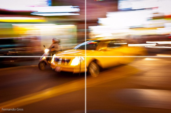
So, when I read Scott McCloud talk about the power of putting a character in the dead centre of a frame, part of me, the part that has not totally been beaten down by the rule of thirds shouted – yes!
McCloud then goes on to talk about the power of leaving the centre of a frame vacant and how that empty space can, depending on the arrangement of the subjects in the image, create a sense of story or intrigue.
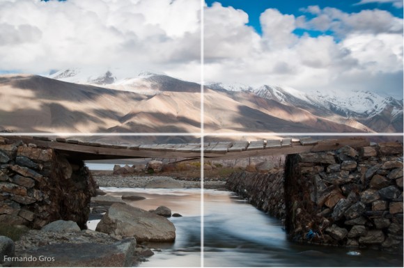
When photographers talk about the rule of thirds, they highlight the importance of placing objects on the intersections of the thirds, be it faces, eyes, lips or whatever. But, what often gets missed is the question of where to put nothing – empty space, negative space, leading space, call it what you will.
In the same way that context in an image can tell a story, perhaps books on a shelf that suggest someone is a student or librarian, so absence, or nothingness in an image can convey a story.
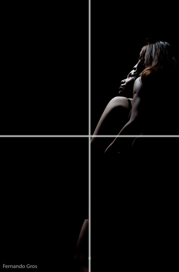
The absence of objects in an image can help tell a story. McCloud gives some classic comic examples; empty space suggesting a mysterious absence, a distance to be crossed or an unseen object of attention. Sometimes what we don’t put at the centre of the image is just as important as what we do put there.
Instead of just using a grid to suggest where might put something in our image, we can also use a grid to help us place nothingness within the image as well.
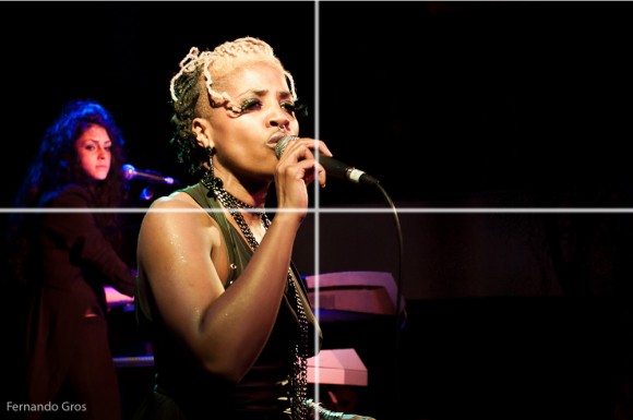
Finally, some photographers get defensive about the language of the rule of thirds, as if it some kind of law or requirement of good composition. But, my sense is that the rule of thirds is a rule in the sense of being a custom or habit. It’s a bit like the way we might say, “as a rule, we drink water with our meals.” Certainly, in my home, we do drink water with our meals. But, if there’s pizza on the table, we’d be just a likely to serve up soft drinks, or beer instead.
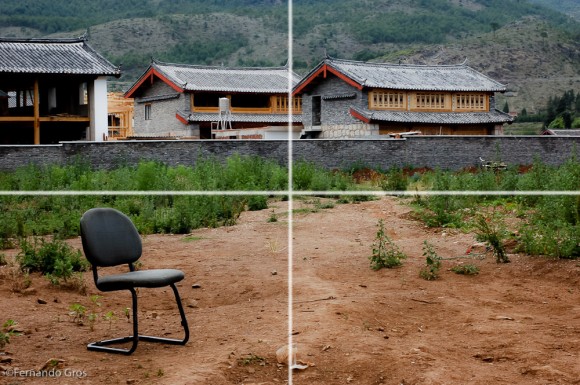
Perhaps a better way to think of rules like these is to see then as accepted truths, or received wisdom. We have the benefit of generations of visual artists who have gone ahead and discovered that grids (like the rule of thirds) can help make images more powerful. Whatever grid we choose to use, thirds, halves, or even Bento Boxes doesn’t matter as much as the fact that as photographers we are open to the knowledge that other visual artists have made available to us.


