The Next SoundCloud
SoundCloud has launched a new layout and style with impressive features. But, there’s also a few issues they need to address as well.
SoundCloud, my favourite musician-oriented music streaming service is starting to roll out a major facelift (and upgrade) to it’s web based services. Today I was fortunate enough to get access to the Next SoundCloud. The changes are impressive.
The Beat Doesn’t Stop
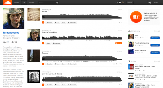
SoundCloud won a lot of people over with its clean an minimal layout. The new design is still very clean and sharp, but manages to put more information on each page. You also have infinite scroll through a users songs, so there’s no wait for new pages to load up. The whole look is fresh and current.
One key feature is the new menu header. This gives you the usual navigation functions. But, it also hosts the waveform. That means you can start playing a song and if you go surfing around SoundCloud the song will keep playing in the background (SoundCloud call this continuous play). Then wherever you end up, just click the waveform in the header and it will take you back to the song’s page.
It’s a simple thing, but keeping the beat going is so important for a music service. We don’t want the song to stop playing, just because we are checking out who the artist follows, or moving from an artist page to a song page.
Some Layout Considerations For Artists
The new layout makes the artist information more prominent. Your avatar picture displays about twice as large (might be time to invest in a new picture) and the bio and song information text gets a larger, more readable font. Also, the song graphics are more important now and songs without an uploaded graphic take on your avatar picture by default.
In the new layout, it really makes sense to add a good graphic, logo or image to every song you upload.
You can use the text to say something about yourself, or your songs more clearly and directly. In fact, my first reaction to the new layout was to say to myself, “I need to rewrite my bio and song info.” My second reaction was “people are really going to notice the buy button now!”
The Social Thing
SoundCloud have improved the social side things in very useful ways (in contrast to 500px gamification antics). On an artist page you get “following in common” information and links to recent likes and comments by the artist. Given that you can surf these links without stopping the song that is playing, discovery of new material became a whole lot more fun.
And, there’s a new scrolling window for in-song comments. It’s a little hard to follow on heavily commented upon songs, but the comments are a lot more readable now.
Lists -The New MixTapes
You can now add other people’s songs to your lists and even combine them easily into one long waveform. This is the coolest and easiest to use digital version of the old mixtape idea.
There is also a repost button, that allows you to add a track to your own SoundCloud stream and share it to your followers. This feature is great for music writers/bloggers, promoters and event organisers, or anyone who wants to share a curated playlist with their followers.
The Most Interesting Little Button
Below the artwork on each song information page there is a new little button labelled “Report copyright infringement.” Press this and a page opens where you can report copyright issues in detail. This is a clear sign that SoundCloud is maturing into a more commercial platform.
Conclusion
The Next SoundCloud is not complete. Some features are still missing (including stats, some settings, uploading and group management) and SoundCloud are promising more new features. But, it’s a beefy and substantial upgrade for this service.
The social features have suddenly become a lot more interesting for non-musicians. And, for artists, it’s a very complete solution, with a reassuring nod towards copyright protection.
I’m very excited by what SoundCloud have given us so far and I look forward to seeing the rest of the features unveiled in the coming weeks.


