The Philosophy Behind The Portrait And Process
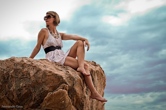
The image above is a portrait (a snapshot really) of Justine Brooks, which I took on Saturday while in Shek-O. Justine is a Canadian jewellery designer (she’s wearing some of her pieces in the image) whose work draws inspiration from natural seaside textures. It was kind of a tough situation to take a photo. A […]
The image above is a portrait (a snapshot really) of Justine Brooks, which I took on Saturday while in Shek-O. Justine is a Canadian jewellery designer (she’s wearing some of her pieces in the image) whose work draws inspiration from natural seaside textures.
It was kind of a tough situation to take a photo. A storm was rolling in, so there dramatic clouds in the sky. But, it was late morning and the light was kind of harsh. I decided before taking the image that I would try to shoot something I could work on later at home. So I went for an exposure that retained some detail in the sky, but still gave me enough light on the skin and rocks to create a decent final image.
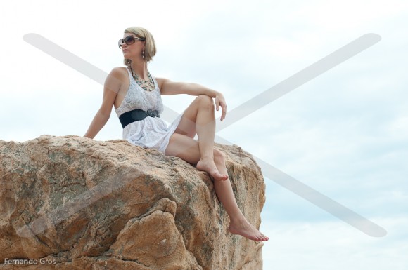
This image (with the paranoid “X” through it) is what came straight off the camera. As you can see, it’s pretty flat and a bit blown out. Not a lot of drama there – certainly not like I remember the scene on the day.
Before getting into how I went from the RAW image to the final portrait, I’d like to make a comment on “photoshopping” & realism. To me photography is a way of editing reality. All photos are edited interpretations of the world around us. The extent to which we trust, like, rely upon or value an image depends on the editing process involved and how we feel about that process (or whether we notice it).
The reason I picked up my camera in this instance was to capture a contrast – the rock, the jewellery-maker and the sky. These were contrasts in texture and colour that I felt connected with Justine’s story as a designer who works conceptually with these types of material differences.
To develop this image I took it from Lightroom into Photoshop where I created four copies of the image (four layers of the same photo). My goal was to use the familiar technique of overlaying a black & white image over a colour one. But, I first had to tweak both sides of the equation.
I started by working on the first two layers. The bottom image I lightly developed to create a good natural image in terms of subject and rocks. For the layer above that I pulled the tone curve heavily to bring back lots of detail and colour in the sky. Then I created a mask on the top layer, to allow the bottom natural image to come through. There are plenty of ways to create masks, but I prefer to paint them, rather than use selection tools.
Next I went to the top two layers. The third layer was converted into black & white and I moved the controls to create an image with a lot of contrast, darkening the blues and reds in particular. Then I focussed on the top layer, desaturated and duplicated it. I went to the new top duplicate layer and choose Divide, from the blend menu. Then applied a Gaussian Blur to this top layer, which brings out a pencil outline, depending on the setting you choose (this is a neat trick I’ve seen in lots of poster making tutorials). Once I was happy with the details here I merged these top two layers into one layer.
Before going forward, I grabbed a soft brush with white colour and moderate opacity and painted on this poster layer. Blending this layer will create strong outlines and sometimes it works best to soften the effect a little on skin regions and in this case, cloud).
Then I blended the top layer by using Colour Burn and the second from top layer (the high contrast black & white) by using Overlay and the adjusted the opacity on each. Finally, I merged all the layers and brought the image back into Lightroom for some final adjustments. That’s the photo you at the top of this post (for most of my images though, I do everything in Lightroom).
Of course, the scene didn’t really look like my final image. But, it didn’t really look like the basic image that came off my camera either.
And, to me this is a really important issue – why are we bothering to make a photo in the first place? For me, photos are always an edited version of reality. When we point our camera at something we are choosing not point it at a whole bunch of other things out there in the world. We’ve edited reality in order to focus on something we find compelling, a story that is worth telling.
In the same way, when we process an image, we are also editing, continuing that chain of decisions we made to bring our focus onto a moment, a set of contrasts, a mood and a subject. Hopefully when we line up our reasons for taking a photo, with the way we shoot the image and later process it we can create something that continues to capture our imagination long after the moment has passed.


